Chosen because of his cool and contemporary approach to modern film poster design - he uses beautiful, strong and engaging photography/screen shots from the movies he is designing for, alongside a considered, modern typeface. The posters he creates seem to be able to capture the theme of the movie in a subtle way.
Daniel Zender
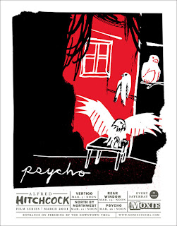
His film poster designs for Hitchcock films display a witty and unique illustrative style. The almost child like style of them goes against the very adult central themes of the auteurs movies, although this style has been used to attract a more youthful audience. There is a confident use of colour and composition within the imagery, which makes these posters more unique and interesting to view than more mainstream Hitchcock posters.
His film poster designs for Hitchcock films display a witty and unique illustrative style. The almost child like style of them goes against the very adult central themes of the auteurs movies, although this style has been used to attract a more youthful audience. There is a confident use of colour and composition within the imagery, which makes these posters more unique and interesting to view than more mainstream Hitchcock posters.
Simon C Page
Simon's film posters use interesting and witty imagery to communicate the films central themes to the viewer. There is a very simplistic illustrative style running through his posters which enhances the simplification of the films message/iconography, and means that they are easily recognisable to film fans, and also immediately engage the viewer, creating an interest in the film.
Simon's film posters use interesting and witty imagery to communicate the films central themes to the viewer. There is a very simplistic illustrative style running through his posters which enhances the simplification of the films message/iconography, and means that they are easily recognisable to film fans, and also immediately engage the viewer, creating an interest in the film.
Saul Bass
Saul Bass is one of the most iconic designers for film posters of the 20th century. His simple, block colour designs immediately engage the viewer, and the simple silhouette illustrations cleverly symbolise key elements of the film, whilst creating dramatic imagery. He transformed the art of the film poster, freeing himself from the previous conventions of mainstream film advertisement to create something fresh and beautiful.
Saul Bass is one of the most iconic designers for film posters of the 20th century. His simple, block colour designs immediately engage the viewer, and the simple silhouette illustrations cleverly symbolise key elements of the film, whilst creating dramatic imagery. He transformed the art of the film poster, freeing himself from the previous conventions of mainstream film advertisement to create something fresh and beautiful.
http://designmuseum.org/design/saul-bass
http://www.guardian.co.uk/artanddesign/2011/oct/30/saul-bass-life-film-review
http://www.aiga.org/medalist-saulbass/
http://www.telegraph.co.uk/culture/art/art-features/8855960/Martin-Scorsese-on-the-talent-of-Saul-Bass.html
http://www.juxtapoz.com/Current/bass-notes-the-film-posters-of-saul-bass-at-kemistry-gallery-london
La Boca Design Studio
La Boca's film posters, although not similar in terms of design style, successfully communicate to and engage the viewer in an incredibly stylish way. The modernist influenced Black Swan posters use bold and clever imagery to symbolise the dark central themes of the movie, and further enhance the directorial style of Darren Aronofsky. They have a talent for capturing the essence of the film in a style that still honours some traditional film poster conventions, whilst pushing for more interesting and unique designs that allow them to grab the attention of more design conscious film goers.
La Boca's film posters, although not similar in terms of design style, successfully communicate to and engage the viewer in an incredibly stylish way. The modernist influenced Black Swan posters use bold and clever imagery to symbolise the dark central themes of the movie, and further enhance the directorial style of Darren Aronofsky. They have a talent for capturing the essence of the film in a style that still honours some traditional film poster conventions, whilst pushing for more interesting and unique designs that allow them to grab the attention of more design conscious film goers.
http://laboca.co.uk/
http://www.debutart.com/illustration/la-boca#/illustration
http://www.guardian.co.uk/film/filmblog/2010/dec/20/black-swan-posters
http://grainedit.com/2010/03/09/la-boca-design/
http://www.fiellblog.com/blog/2011/2/3/la-boca-designs-black-swan-film-posters.html
http://www.designweek.co.uk/sixty-seconds-with-la-boca/3023880.article
Olly Moss
Olly Moss' film posters quite clearly take inspiration from Saul Bass - the visuals he creates are similar in their simplicity and ability to symbolise the main elements of the film, although they seem to push the ideas of the film even further, in an incredibly intelligent and witty way.
http://www.ollymoss.com
http://www.wired.com/underwire/2010/12/olly-moss-star-wars-mondo/
http://www.empireonline.com/features/2010/olly-moss/
http://www.thedailybeast.com/articles/2011/05/09/olly-moss-the-savior-of-movie-posters.html
Know Your Blogger - Olly Moss from Threadless.com on Vimeo.


No comments:
Post a Comment