
Link taken from a blog post I created after Richard's seminar on the Russian Revolution. I thought that the whole subject was kind of fascinating, and the designs created in that time are incredibly interesting and still relevant to the world of graphic design today.

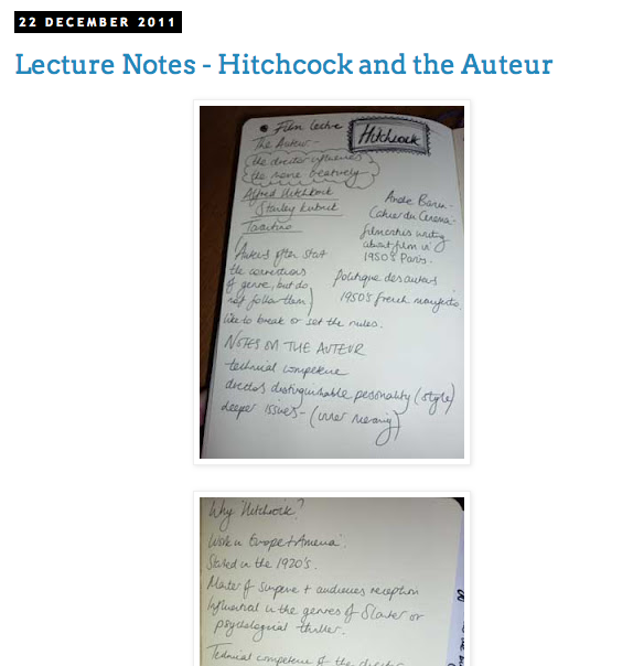
Alfred Hitchcock Lecture
I felt like all of the film theory lectures had interesting content, and it was good to look at Hitchcock's work because I had never really seen any of it previously, mainly because I had been told it was centred around horror and I don't deal well with that at all. I'm also interested in looking at the Auteur because I sometimes feel there is a definite style over substance in cinema, so it was good to look at the critics opinion in the lecture.

Italian Cinema Lecture
I liked the Italian cinema lecture because it explored the working class element of cinema in the 60's and 70's, and it also looked at some classic films that I had never seen before but have always wanted to. Their style of cinema was very rooted in style and other conventions of the Giallo films were cool to look at as well.


History of Typography Lecture
As a graphic designer I guess this should just automatically be of interest to me, and it was good to learn the origins and the way that type has developed over the years because it was definitely something I had been quite ignorant too before studying here.


The work of Brian Keplesky
http://bryankeplesky.com/
I originally chose Keplesky's work for the Blog Marry Avoid task, and I'm still blown away by his work. I love the nostalgic aesthetic, the light hearted style and the quirky/original illustrations.

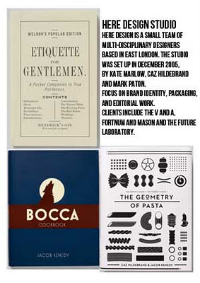
The work of Here Design Studio
http://www.heredesign.co.uk/
I also chose the work of Here Design Studio for the Blog Marry Avoid task, after being introduced to it by Emma, and I find their work to be incredibly stylish and classy. They have a very contemporary but edgy aesthetic, that means their work looks high end without seeming too boring or uptight. 
The photography of Jon Naar
http://jonnaar.com/portfolio/graffiti.htm
The name of this street photographer was given to us in the Street Art lecture, and whilst I'm not the biggest fan of all graffiti work, I really like the images he has captured, and the style in which he has captured them. His photos are very honest, and don't try to glamorise anything about the street art, instead, they highlight quite deprived areas of New York.


The Editorial work of Michael Freimuth
http://michaelfreimuth.com/
I researched Michael Freimuth for our upcoming PPP task where we must create a double page spread, and I think his editorial work is some of the best I've seen. Everything from the typography used to the stock is beautiful and incredibly considered, and he caters to the clients whilst still retaining a sense of style.


The Work of Dave Perillo
I love Dave's work because of the nostalgic Hanna Barbera style he employs to create illustrations, everything is very fun and light hearted, and focuses mainly on pop culture references which I also love.


Graphic Design in the Public Domain
I enjoyed finding the images for this context of practice task with Jo because I love the originality of the ideas that these campaigns use to draw attention in the public, and also the use of humour and intelligence displayed in many of the projects. This is what really interests me in Graphic Design.


No comments:
Post a Comment