


Whilst all of these designs get the message across, I feel like mine should develop more of a bold and simple message, such as the road signs.
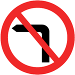

They are universally recognisable, and the bold colours command the viewers attention, and also signify the fact that this is an order and not a request. The simplicity of the design is something I hope to achieve in this same style.

This is the sort of image I hope to be able to develop in my posters. It's bold, clear and concise, although it is lacking in humour and a definite tone of voice, as it is aimed at the general public. However, I want to use a more modern and possibly prettier typeface, as this one isn't very interesting, and in fact looks kind of dated. In keeping with this poster and the other posters I've researched, I will try and keep all my information central, so that the message is clear.
No comments:
Post a Comment