
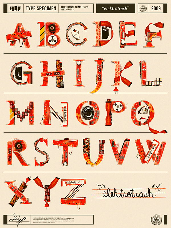
Currently my inspiration for this project. After the crit on Friday, I've started to look at more elements of Ste's personality, but was struggling to think of how to place them all together into a font so they'd look good. I hadn't found any fonts that had done this until I stumbled across this beauty on welovetypography.com.
I think this has been based on different film and music equipment, and it all works perfectly in building a simple structure for the typeface, but making it look really fun and cool with the style of illustration and the bold colour. Not many of the letters have repeating elements though, which is something I will be exploring in my own work, but it's so good just having this to look at.
Personally, I think A, N and T look best, because of the composition of the separate pieces. They don't perfectly fit together, which makes it feel more interesting and kooky.
No comments:
Post a Comment