Good web design
Its Nice That is constructed very simply in terms of it's interface, with a clean grid structure that works both aesthetically and in terms of helping you navigate the site quickly and easily. The one main column being used keeps it looking sleek, and avoids the user from being overwhelmed by information.
It also has a useful and effective search tool, that actually allows you to view thumbnails of the separate posts so you can see immediately if it is what you are looking for.
It also has a useful and effective search tool, that actually allows you to view thumbnails of the separate posts so you can see immediately if it is what you are looking for.
The September Industry again has a clean and contemporary feel to the design of the interface. All of the information is a centred column, with a neat grid format, and again uses high quality thumbnails to allow you to see whether the post will be of interest to you. All of the written information is kept to one side, and the information doesn't overwhelm the page. It's also easy to search and navigate from the home page.
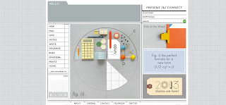
Hey Studio's website has a more experimental interface, which utilises all of the space available. Mainly image based, it works well considering that is a design studio, and they want you to appreciate the visuals of their work first before you research them further. The layout also successfully reflects their cool, minimal design style, and the block colour background allows their use of colour to be put across effectively.
Again, an incredibly minimal design which reflects the sleek and contemporary design aesthetic, and also allows the images and designs to be the primary focus.
Simple design, high quality images that reflect the design aesthetic. There is a small amount of written information that compliments and doesn't overwhelm the design of the website.
I like this website because of its experimental use of type. At first the purpose of the shapes is unknown, until you scroll down further and they create the headline text. The simple, contemporary design compliments the high quality of the graduates design work, and intrigues you to explore further.
This site, although a little more heavy on information, is presented in a clean grid layout that makes it aesthetically good to look at, and also easy to navigate. The search tool is easy to use and the information is presented in a high quality font, and the images are also of a high standard.
Quite a simple design again, with a use of high quality images and fonts that compliment the website's focus on art, culture and fashion. The website is also easy to navigate.
Incredibly simple, with a minimal aesthetic and a minimal use of text. It focuses heavily on the high quality images, to reflect their primary focus effectively.
Bad Design
Although I really like the design work that is posted onto this blog, the actual design of the site isn't incredibly useful. The search tool is difficult to use as once clicked, it shows only information and no image, so realistically you could be searching for a long time. I also think the user face could be simplified and made sleeker to reflect the quality of the work they display.
Pinterest
Just far too cluttered and confusing with all of the text and the images. It needs to be simplified somehow for me to actually enjoy using it.
The Book People
I think it's probably obvious as to why I don't like it design wise, as it's quite basic and a little clumsy, and there isn't very much consideration being shown for colours and fonts. The search and navigation of the site is ok but could be improved as it does take a while to find specific content.
Amazon
Again, there is information and image overload, that leaves you wondering where to look. The quality of the design hasn't been considered as much as it should, and there are too many garish looking adverts distracting the viewer as well. As they are a global and successful business, I think they need to pay more attention to the website where they actually sell their products.
Hello Giggles
The problem with the Hello Giggles website is the column view I think. Its too thin and long, which I find quite annoying having to scroll through. The main annoyance though is the column adverts that once opened, end up taking over the entire page, and are difficult to avoid. I understand the reasons that websites need to display adverts, but I think they actually deter users and generate very little traffic. I would also prefer the design of the typeface to be less severe and the colours used to be softer.
PNEAC
The use of typefaces, the centred layout with standard, basic text and poor quality images and colours are quite obviously unattractive, and it doesn't adequately represent the high quality of the information they provide to people. I think it affects their credibility as a reliable source.
Rotten Tomatoes
Again, the amount of information is overwhelming, and it is quite clear from the layout and design that they are not bothered by how the site really looks. The colours are vulgar and irrelevant, and the typefaces used are childish and ugly.
We Heart
My main problem with this website is the extras on display, such as adverts and the social network feed, which are distracting and not very nicely designed. There are a lot of design elements clashing with each other, such as colours, text and images.


No comments:
Post a Comment