Designed by Jessica Hische
The branding of this restaurant is beautiful, and includes a lot of detail without being too cluttered. The use of text, neutral colour and illustration is incredibly stylish, and connotes the classiness of the restaurant. The branding is sophisticated and modern, whilst still retaining a nostalgic feel. Although I don't think this style will work for my restaurant, the elements of sophistication are useful to me, and Jessica Hische's work in general is inspiring.
Grill'd Restaurant
The brand identity for Grill'd is one that I feel is very effective, as the design elements are quite unique and fun, and feel very different from most restaurants which are more formal. The line illustrations add humour and appeal to a broad audience, and make the atmosphere of the restaurant very relaxed, which I also feel the script type of the logo does as well. I love the menu design as well, which is unconventional as it feels hand drawn and does not use a grid layout, again conveying the relaxed style of the brand.
The simple use of colours seems to be a theme for most restaurant I look at, and the browns and reds are really effective together.
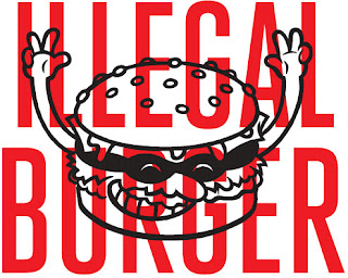
The Illegal burger branding is possibly my favourite ever. The feel of the design is a mixture of adult and child like, which is a humorous balance they seem to have perfected, with the evil burger illustrations. It doesn't look like it takes itself too seriously. The layout of the menu is really effective, and combines the illustrations and text in a really stylish and simple manner. I also love the typefaces, and the typographic elements of the menu in the speech bubble. This use of typography is something I want to explore in my designs.


No comments:
Post a Comment