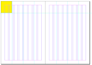
I am now beginning to work on indesign to create the publication, and am deciding how to present both the images and the planner part of the diary.
I plan to have a designer a week, so I am allowing a double page spread for each designer - If I had done a designer a day, I think I would have felt more restricted to having only a single page for presenting the work, and the students wouldn't have gotten a real feel for the range of work produced by some designers.
It also would have meant the diary would be over 365 pages long, which on my budget and time scale feels a little excessive.
As I am placing it on a double page spread, I wanted to work with the idea of placing the weekly planner at the top of the spread, as it frees up more space for images, and I think it will look cleaner and more modern.
I began with the idea of working with colour, either C, M or Y, but on the page I think it looks a little too harsh, plus theres a chance that not everyone will like any one of the colours, and they could seem a little garish.
I decided that it would look better, If I simply stuck to a monochromatic palette for the planner, as most of the work I am featuring is very colourful, and I want the planner to feel like a part of the page, and not something that is competing with the images from the designers.
I began to upload images from some of the designers to test how the editorial could work - I still have to include a small amount of information about the designers, such as their URL and where they are based, as well as their name, obviously. The problem I have with this design is that it is cutting off part of the work, and I do not want to really do anything that compromises the images. I do however like the use of typeface and the presentation of the text, and I will try to work with a similar style.
The faded box looks slightly odd and I still think the design needs tweaking.
I am much happier with this design, where the large black rectangle covers where the weekly planner begins, as it fits in better with the overall design, looks sleeker, and allows me to place all the important text within that space, freeing the rest of the space for the images.
I am now going to continue creating the diary in this style.


No comments:
Post a Comment