These are all pre existing fonts that I have been working from on my design sheets, and whilst I appreciate that the more complex and colourful fonts are probably a lot more visually interesting and pleasing to the eye, I feel like the simpler fonts, like Myriad Pro and Bebas Neue have been better to work with so far because they leave more to be done with the development of ideas, and the way I represent the various definitions of dissolve in my designs.
I also wanted to look at some other hand drawn typography to give me some inspiration.
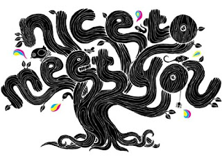
These are some examples I have found of well executed hand drawn type that I feel can help inform my own designs.
Capitan Burrito
SCSH Graphics Group
Maxwell Lord
Edgar Reyes
David Maclennan
Jen Mussari
James Gulliver Hancock
Rachael Anilyse
Out of these images, I think the most successful one, that will definitely help with my design ideas is the collection of hand drawn fonts by James Gulliver Hancock, because he is using black and white, like I have to, and the amount of variation within these is really interesting to me.
The use of white on black as opposed to black on white is something I also want to consider for my own work as a variant within my own designs.
The use of line and the detail within some of the fonts is also something I will explore within my own work, however I am less inclined to create very complicated fonts, as I feel like they will distract from the main statement of the work.
Another favourite is the David Maclennan piece, which from a distance I feel does portray the word dissolve. Although I think it is too complex for me to try and recreate something similar, it's nice to have it as a piece I can look to to motivate me and make it easier for me to produce ideas.


No comments:
Post a Comment