15 May 2013

OUGD501 Evaluation

The skills that I have developed in this module have been mainly focussed on the essay writing, which I struggled with at first, but now I feel that I have developed my writing style and my research skills, and the ability to triangulate and critically evaluate other's work and theories. I have also developed my use of imagery as I have used collage in my work which I have never tried before.
If i'm being honest, this module has been filled with more weaknesses than strengths for me, and I have struggled at points with the work that has been set.
The essay was the main thing that I have struggled with on this module, as it has taken up so much of time and effort, and I am unsure yet whether this has been worth it. I have had to re write it to make it hopefully passable, which has meant that I have lost time that could have been spent on bettering my publication. I struggled with the application of theory and the use of sources in my work, although in doing my re write I do think I have improved my research and essay writing skills.
Applying the level of thought and theory to my publication has proved difficult, and I spent a lot of time trying to come up with a concept, and over-thought what I was doing as a result. This affected my time management of the brief and therefore meant that the print quality of my final publication suffered. If I had left myself enough time to do it, I would have liked to have had the publication riso printed for a nicer texture and print quality, and I also think this technique would have worked well with the 'lo fi' collage style I have used. Although I am pleased with the layouts and the work I have done, I do not think that I have pushed my idea far enough, unlike others who have a whole product range to go alongside their publications.
My strength in this module has been the use of collage imagery in my publication, which I used to relate to Mulvey's idea of destroying visual pleasure and also the construction of the gaze. I think that the images I have created using the collage have been well thought out and are aesthetically pleasing as well having a sense of humour to them, which I always think is important with quite heavy subject material.  I chose to use the gaze in my work because I have gained an understanding of it on previous courses and so felt confident that I could communicate this subject better than others that had been looked at during this year. In terms of tone of voice in the publication, I think that I have managed to strike a balance between informing people of the academic side of the theory, as well as visually communicating it using examples and hopefully by making it more entertaining.
In the future I would like to push my work further, and spend more time focussing on thinking through the concept and the finished product more thoroughly so that my final resolution looks more complete.

Things that I would like to do differently next time
Set aside more time earlier in the module to research my work more thoroughly.
Think more broadly about the possibilities of my publication and what it could be.
Think more about stock and print finishes that could be applied.
Use more sources in my work so that my final resolutions are more developed.
I could research into subjects more broadly, rather than simply researching into what is asked of me.


5= excellent, 4 = very good, 3 = good, 2 = average, 1 = poor


Attendance
3
Punctuality
4
Motivation
3
Commitment
3
Quantity of work produced
2
Quality of work produced
3


12 May 2013

Theory into Practice: Final Product ready for crit


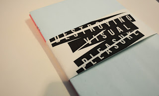
Here is my final printed publication ready to be taken into the crit. Overall I am happy with the print quality and the overall presentation of the final product, I just wish that I had more to show in terms of a range of products. 

11 May 2013

Context of Practice: Final Essay


Finished Essay


Finished Essay with the changes I have made highlighted in red.
I have taken on the feedback given to me in the tutorial: I have cut down the amount of figures I've used, and written more extensively about Laura Mulvey and her theory of the Gaze. Overall, I am happy with my final effort.

10 May 2013

Theory into Practice: Bound Booklets

Destroying Visual Pleasure

Book 1: Laura Mulvey's Theories


Destroying Visual PleasureBook 2: Gender Roles in James Bond 


The booklets have now been bound using the saddle stitch method, which I chose as they were only thin booklets, and also the DIY/collage aesthetic suited being saddle stitched more than it did perfect bound which I think would have made it feel a bit too formal and clashed with the aesthetics of the booklets.
Despite a few minor niggling problems I have with the print quality which have mainly come from manually printing it instead of having it printed professionally, I am happy with the designs of the booklet in terms of layout and the stocks I have chosen, which I think all work well together. 
I think it was a good decision to change the format to a5, as the text works better smaller and feels more readable than an a4 publication would have been.

Theory into Practice: Printed Pages

These are the prints of my publication, which for a couple of reasons I have had to print on my home printer instead of sending off to be professionally printed, which I would have preferred. However, I think the choice of stock I have used has worked well, as the lo fi collage aesthetic of the booklets works with the thinner coloured stock, creating more of a photo copied, DIY effect. Although the stock was 80gsm, I have had to print the sheets separately and spray mount them together, which means the stock feels thicker anyway and more like a booklet.
I have yet to print out my covers, and the bellyband cover I want to package the two booklets in.


9 May 2013

Theory into Practice: Final PDFs


Destroying Visual Pleasure: Book 1
Book 1 focusses on the psychoanalytic theories that Mulvey evidences in her essay Visual Pleasure and Narrative Cinema.


Destroying Visual Pleasure: Book 2
Book 2 looks at 8 important moments/characters from the Bond franchise, exploring the differing representations of gender.

These are the final PDF versions of my books which I will be printing tomorrow. I will be printing onto coloured stock, with each book being a different colour. I want the printed books to look 'lo-fi' because with the aesthetics of the book being reconstruction and collage I think this will be emphasise the effect. I am really happy with the collages I have created and in general the content I have written feels informative, whilst still retaining a sense of humour which I think is important when dealing with heavy writing like this.

8 May 2013

Theory into Practice: Booklet Development

Originally I was going to include an introductory page into the booklets in a collage style, but decided that because of the amount of spreads it would make more sense for the introductions to simply be text on the front page of the booklet. I've just created a simple layout for it, and the focus is on the text now instead of any distracting imagery, plus what kind of imagery could I have used in an introduction that I wasn't already using in the actual spreads?